About the Authors
Jacob
Firuta
Jacob writes reports, blog posts and other pieces of content to help businesses offer better support and sales services. Over the years, he prepared over 140 self-service knowledge base articles. You can check his latest work on the LiveChat Blog and in the Resources section.
Jonny
Everett
Jonny is a co-founder at The Chat Shop. He’s helped customers in over 13 industries use the power of conversation to increase sales and improve customer service through expert UK and US based live chat outsourcing and consulting. You should follow him on Twitter here @jonnychats.
01Introduction
When thinking about online sales and ecommerce, you probably get the picture of a website with a shopping cart and a bunch of products. That definitely works but there is so much more to be done on an ecommerce website.
Your sales process can go beyond the boundaries of normal websites by integrating different channels as well as a mobile-friendly design. You can use tools like live chat that are normally associated with support to create proactive sales campaigns that reach out to customers who browse your products.
Jacob Firuta from LiveChat and Jonny Everett from The Chat Shop prepared this collection of tips, know-how and data you can use to supercharge your sales.
The aim of this ebook is to help you tweak and optimize your website for sales as well as show you how to use live chat for ecommerce.
Over the course of this ebook, you will learn how to:
- Add chat to your sales funnel and have it work with your other channels,
- Make your website mobile-ready for all your mobile customers,
- Create a game plan for your live chat to facilitate more sales,
- Stimulate more and bigger sales through excellent customer service,
- Target specific customers with your live chat,
- Segment your customers so that you can market to them more effectively.
02Multi-channel marketing

Most of your sales will happen over time and over several channels. See which channels you should focus on and how they can work together to turn website visitors into potential customers.
In this chapter, you will learn what is multi-channel marketing, how you can get your own multi-channel marketing strategy started and how different channels can work together.
2.1What is multi-channel marketing
Multi-channel marketing is a marketing strategy based around the idea that customers are more likely to buy when they can use their favourite channel. For example, a shop may offer both online and offline options for different customers to maximize the number of sales.
Your multi-channel marketing strategy can include channels like your website, social media, email, live chat but also sales from your offline stores, catalogs and phone orders. In multi-channel marketing, all these options are equally viable if they all lead to sales.
Multi-channel marketing is about choice. You need a consistent brand story across channels so that customers can pick the channel they want to use (whilst hopefully still choosing you). It’s also about the cooperation of the channels. Potential customers should have an easy way to switch to a different channel and they shouldn’t have to start the entire process from scratch when they do.
Multi-channel marketing allows you to get a bigger slice of the market. You get to reach more customers on channels where they are the most likely to make a purchase.
2.2How to start a multi-channel marketing strategy
To get your very own multi-channel marketing strategy started, you should keep in mind that there are a few requirements and conditions you need to fulfill to make it a success.
2.2.1Channels should cooperate with each other
First off, multi-channel marketing is not just about making several sales channels available. If you start by setting up a ton of different channels and then just hope that they will bring extra revenue, you will end up doing a lot more work and not seeing a great return on your investment.
The trick is to have several different channels working together. You want to make it really easy for potential customers to move from channel to channel. The sooner they can reach their favorite channel, the greater the chances of you getting another sale.
To make easy switching possible, make sure that there’s always an alternative route available. For example, you can include a phone number or an email address in your catalogue. In the same way, you can offer live chat on your online store. This way, customers have several options to choose from when wanting to get something from you.
2.1.2Multi-channel campaigns
Since it takes a few contacts, or touches, with your business to make a sale, you should make sure that all your channels advertise your product in a similar way. If they all run completely different campaigns, your customers may see them as several different products instead of a single product advertised across several channels.
Make sure that feeling of familiarity is present. Customers who see your campaign should go “Oh, I saw that already in TV/email/catalogue” when spotting your website advertisement. Score a couple of ‘Ohs’ like that and you will get a sale.
IKEA is a great example of a company that keeps a very unified look in their marketing. No matter if it’s their website, their catalogs or their ads, you always can tell that it’s IKEA by the unique font, the art direction or the characteristic cardboard elements.

2.1.3Start small and start smart
You don’t have to go for absolutely all channels. If you know that very few of your customers would like to call you to order something, you can skip phone as a channel and focus on more lucrative alternatives.
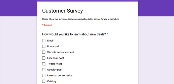
Preparing a simple Google Forms survey will take 5 minutes of your time and will give you a lot of information on the channel preferences of your customers. You can start with the 3-4 most popular channels and build your way up from that. When you feel confident that your presence is well established on a channel, you can move to another.
2.1.4Know who you’re selling to
Knowing who to pitch to is as important as knowing where to pitch. You need to know who you are selling to. This is why it’s smart to create ‘buyer personas’ – the customers you might run into when selling on various channels. These buyer personas represent different groups of customers interested in your product. By tailoring your message appropriately to those groups, you can increase your chances of making a sale.
Keep in mind that the ‘core’ of the campaign should remain the same across different channels. You don’t want to sacrifice the familiarity effect. You should make small adjustments to the way you tell the message, but the message itself should stay the same.
Here’s an example survey you can put together in a couple of minutes:
2.1.5Tools that will help you better understand your customers
You will need to do two things to make that happen: keep track of your customers and see which actions drive sales.
For the first part, you will need to have a CRM system in place. CRM stands for Customer Relationship Management and it’s a tool that allows you to keep track of all the interactions your company has with a customer. When picking up a CRM tool, make sure that you have the ability to connect all your channels to the CRM so that no interaction goes unrecorded.
For the second part, you will need an analytics tool that will allow you to look at the way customers are moving through your website to make a purchase. Using this information, you can optimize those paths and improve your sales conversion.
2.3You can’t have multi-channel marketing without multi-channel customer service
When selling on multiple channels, you also need to be ready to answer customer service questions on those channels. You can’t simply start selling on 10 different channels and wish for the best when customers start asking questions.
The help option should always be available and, preferably, it shouldn’t require switching to a different channel. When doing multi-channel customer service, you have a number of channels to work with:
- email (cheap and fairly reliable but tends to be slow),
- phone (much faster than email, but takes a lot of manpower),
- live chat (as fast as phone and you can have several conversations at a time),
- help desk (good when email is not enough and you need to organize),
- social media (not optimal but you need to be ready to answer customer service questions here),
- self-service (the most scalable form of help that doesn’t require an agent).
Key things to consider with multi-channel marketing:
- Channels should cooperate with each other,
- Keep consistency across marketing and service channels,
- Start with the most important channels and then build up,
- Know your ideal customer as they’re who you’re trying to sell to,
- Invest in decent CRM and analytics tools.
03Mobile ecommerce marketing
Mobile commerce is a whole other marketing channel through which potential customers can find your business and make purchases. And these purchases can happen anywhere, at any time.
The meteoric rise of mobile shopping is why this medium deserves a whole section in our eBook. Take a look at your website analytics and you could find that the majority of your traffic is from mobile or tablet devices rather than desktop. Optimise for mobile (if you haven’t already) and you could dramatically increase sales.
You can’t count on your users’ goodwill and understanding if you offer a website that simply doesn’t look good or is difficult to use on mobile.
3.1A few takes on mobile design: responsive, subdomains and apps
When it comes to preparing your mobile website, there’s a couple of ways you can go about it.
3.1.1Responsive mobile design
A mobile website that has been prepared with responsive design in mind will look good on mobile devices as well as PCs/laptops. It’s a way of preparing both versions of the site using the same code. Whenever someone accesses the website from a mobile device, the website ‘scales’ appropriately. You are generally able to keep a similar look without having to prepare two separate versions of the same website.
The main benefit of running a responsive mobile website is the fact that you keep one set of code for all versions of the website. You also don’t have to think about adjusting the look of the website for each device separately. The code is written in a way that will automatically adjust the page to make it look good on all devices.
Most of the copy and resources you use on your normal website can also be used on the mobile version.
Finally, the navigation scheme and the general feeling of the website stays the same. Responsive design requires a bit of consideration whenever you introduce a new element to the website. You need to keep in mind the fact that it will affect the look of your site on all devices. So a huge background graphic may look good on your desktop, but it can look out of place on a mobile device.
3.1.2Mobile subdomain
If your current website is prepared in a way that makes responsive design really hard to implement, you might want to go for another option: a subdomain of your website dedicated to mobile use.
Think of all the pages you know that start with “m.” whenever you access them from your phone. These are subdomains of the main website prepared to look good on mobile devices.
The mobile subdomain requires considerably more work than a responsive design in the long run. Even though it may be easier to prepare a subdomain with a different code and look, you will need to update two code bases instead of one. Every time you add something new to your main website, you will also have to add it on the subdomain.
This can be very time-consuming if you update your website frequently. For example, if you tend to add large batches of new products every week, a subdomain would probably not be the best choice for you.
3.1.3Dedicated mobile app
Preparing and launching a mobile app for you ecommerce business is another way of reaching your mobile audience.
It’s a completely separate channel that doesn’t necessarily bring a lot of traffic to your website. However, it can be used to bring in additional revenue as customers usually can make purchases directly in the app.
Since the app has to be downloaded by a customer first, it would probably be best if you introduced it to your most loyal and returning customers. You can boost that effect by adding some kind of a loyalty program into the app.
You should treat a mobile ecommerce app more like an addition to an already working mobile website instead of seeing it as an alternative.
3.2Mobile design tips for your ecommerce website
There are a couple of aspects of a mobile implementation that can make or break it. Here’s what you should look out for and how you can make sure that your mobile ecommerce website is a success.
3.2.1Clear call to action
Customers can make very quick decisions when browsing through a mobile website. You should make sure that they always know what the next step is before they lose interest and leave and never come back.
No matter which part of your website a user is browsing, you should always have a clear call to action (CTA) available. It should not only be easily noticeable but also should clearly state what will happen if a customer takes the action.
For example, when browsing through a catalog of your products, a customer should always be able to easily locate the ‘add to cart’ button.
3.2.2Be aware of space constraints
Apart from having very little time to get the attention of a customer, you also don’t have a lot of space to work with. You will constantly have to check if the copy or the graphics you’ve chosen for your website fit in the mobile design.
The less is more maxim is especially true in the case of mobile websites. You have way less space to work with so you need to make certain concessions. You will need to come up with ways to simplify the content on your website to make it feel less cramped.
For example, if you have several paragraphs of copy written for your main page, you will probably need to shorten it to a few sentences.
3.2.3Finger-friendly design
Don’t you just hate it when you browse through a mobile website and there’s a popup with a ‘close’ button so small that you will miss?
Since your mobile customers will control everything using fingers (or, in particular, their thumbs) you need to make everything big enough so that it’s easily accessible.
If you don’t want your customers to get frustrated and leave your website, all the elements of your page that require an action – all buttons, links, CTAs and photos – should be big enough that customers don’t have a difficult time pressing them with their fingers.
3.2.4Testing mobile design on multiple devices and browsers
Whenever you add something to your website or you make any design changes, make sure to always test it by accessing the page from different devices.
A photo that may look good on a big screen can turn out to be really ugly on a smartphone screen. Testing will help you catch those situations and deal with them before releasing new pages.
The extreme way to do this is to own several most popular devices and check how the affected page looks on all of them. Since it can be a bit pricey to get every new device that comes out, you can go for the alternative and use a software that emulates different devices and screen sizes. For example, you can use BrowserStack to check how a website looks like on phones, tablets and also desktop browsers.
3.2.5Size limitations
Since the window of attention you get from an average customer will be fairly small, you can’t have situations where your mobile page takes ages to load.
The speed of connection of many users will be a fairly limiting factor. If you place a lot of high-res graphics on your website, it will definitely look nice. However, it will also take way more time to load. It may not be a problem on desktop where we have cable connections but on mobile it’s a whole nother story.
Load times are crucial. If your page doesn’t eat up much of the customer’s connection, they will love you for it. You can use tools like Smush it or ImageOptim to keep the size of your website graphics low for optimal mobile performance.
Preparing a mobile design for your website may seem like a lot of work, but if you start right and keep track of certain limitations, creating a mobile website will require minimal work and maintenance.
Key things to consider when optimising for mobile:
- Choose responsive mobile design, mobile subdomain OR dedicated mobile app based on the resources you can commit and your existing site design,
- Each section of the journey needs a clear call to action,
- Make things easy for fat fingers,
- Test on every device possible,
- Use compression techniques to ensure fast page loading.


