Showing top 0 results 0 results found
Showing top 0 results 0 results found


If there’s one thing that can ruin your work in a heartbeat, it’s poor user onboarding. All the hard work you’ve put into getting people to start a trial of your service will be for nothing if they can’t figure out how to use it.
It won’t matter that your product is a perfect fit and can solve all their problems. All the value in the world won’t help you keep a customer that doesn’t know how to use your product.
User onboarding can either make or break your business. It’s up to you to help the customer understand and be successful with it.
Having said all that, would you believe me if I told you that offering more options in your user onboarding can make it more easy to go through?
It sounds crazy, I know, but it works.
We had the same problem. We were losing a big chunk of leads to faulty user onboarding. Instead of dumbing it down even more, we offered more options to our users.
And it worked like a charm.
What is user onboarding
User onboarding is all about making sure that your users are successful with your product.
You want to help your users overcome the initial difficulties so that they can reach the value you’re offering ASAP.
There’s a simple reason: the longer they need to wait to see the value, the more frustrated they get. The less hoops they need to jump through, the better.
It’s a very tough period for every customer. They have problems that need fixing. By guiding these users through this difficult period by using simple copy, visual cues and more, the user is able to reach the value you’re offering before churning out.
Here's how a basic user onboarding process looks like:
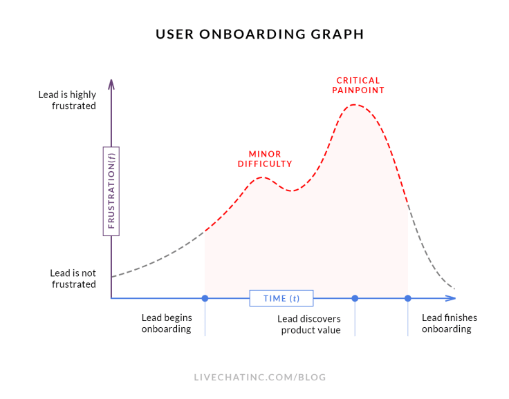
Onboarding experience in LiveChat
A big part of our user onboarding is the installation of LiveChat code.
This process literally makes or breaks the onboarding. You see, businesses want to use LiveChat to chat with people on their websites. If the LiveChat code is not on the website, no chats can go through.
The value (chats), can’t be reached unless the particular onboarding step (code installation) is complete.
Even though we had a lot of companies signing up for our service, only a portion of them ended up installing the code on their websites.
Our old onboarding was very basic. After signing up, users were redirected to our application where we showed them the code they need to install. A short piece of copy explained what they need to do.
It looked like this:
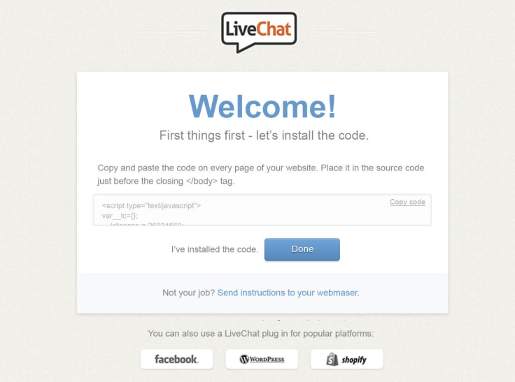
The majority of LiveChat users, around 88 percent (!), wasn’t able to complete this step. People either didn’t know what to do with it or left it for later and never came back.
Fixing the user experience
Our user onboarding was in dire need of an update. We wanted to make it less complicated and leave options for people who didn’t know how to code.
Instead of a boring old box with a code snippet, we prepared a screen that beamed with options and routes users can take.
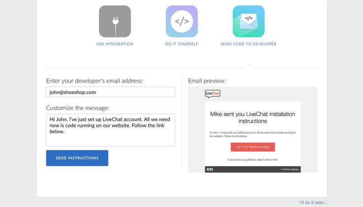
Take a look at how sexy our new onboarding is:
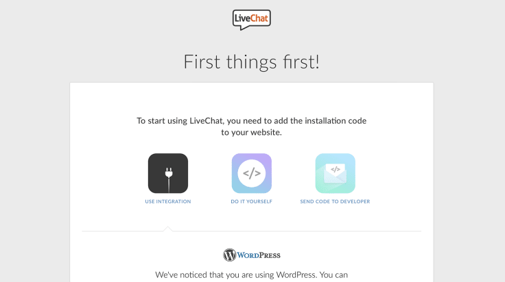
Instead of a basic code option, we now have three! Users are not simply left with the code. They can now choose how they want to proceed:
- install the code themselves,
- get somebody to do it for them,
- use an integration to do it with a few clicks.
You want to know what’s the best part about the change? The three options were available in the old onboarding as well. They were simply not eye-catching enough (integration buttons) or nearly invisible (send to developer link) to the users.
If offering more options to make something simpler sounds strange to you, you’re absolutely right. However, we found out that it’s not really about offering two more options but offering alternative onboarding routes for different types of users.
Let me explain.
To find out what steps we should offer, we checked who usually uses our product. We narrowed it down to users who:
- were able to install the code on their own,
- had no idea how to install the code but had people who could do it,
- had no idea what to do with the code because they used a popular CMS system that did it for them.
With groups of users like this, it didn’t make sense to hide some options under links and make them harder to reach. Now no matter what type of user we reach, we know that almost everyone will have an option they can use.
We didn’t simply make the buttons bigger though.
All the options got new, crisp and more intuitive copy. Apart from updating the copy, we now try to cut down on the number of steps a user needs to take.
For example, when choosing the ‘integrations’ option, a user doesn’t have to browse through a dozen integrations just to find the one they are using. By getting their website address earlier in the onboarding process, we can look at their code and see what 3rd party tool they are using and suggest it right off the bat.
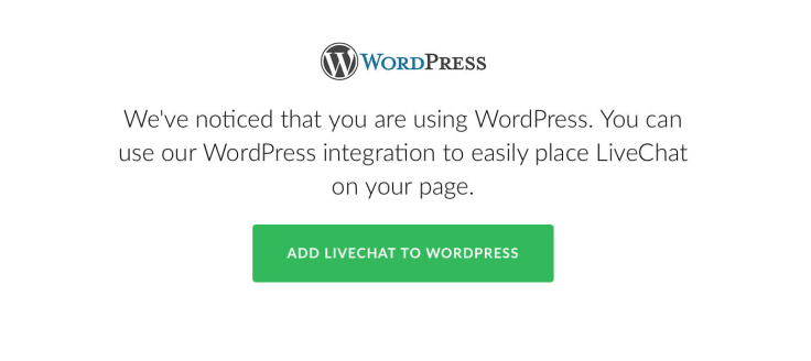
When choosing the ‘send to developer’ option, users only need to enter the developer’s email and click on the send instructions button. In the email, we offer a brief description but the user has also the option to modify it to make sure the developer knows what is happening.
3x times higher conversion rates
As a result of this change, we’ve seen a bump in the number of users who successfully installed our code on their websites.
From a measly 12 percent of users who installed the code, we jumped to 35 percent after introducing the new user onboarding. And all that by offering more options and not dumbing them down.
However, the task is far from complete and there’s still a lot of ‘Aha moments’ for us to discover and use.
For example, we noticed that a lot of the emails that are sent using the ‘send to developer’ option have no effect. The developer either doesn’t know what to do with the email or forgets that they had to do it. Normally, we have a lot of automated emails reminding the user that the code is not installed. But all those emails reach the person who created the LiveChat account.
We plan to shift some of that responsibility and notifications to the developer, so there is no break in communication.
If you want to see how that turned out, tune in for more when our next post on user onboarding is published, in which we will explain how to write emails that simply can’t be ignored by your users! You can sign up for our blog newsletter to get a notification whenever a new post goes live.
Photo courtesy of Sister72 via Creative Commons.
Get a glimpse into the future of business communication with digital natives.
Get the FREE report





Comments